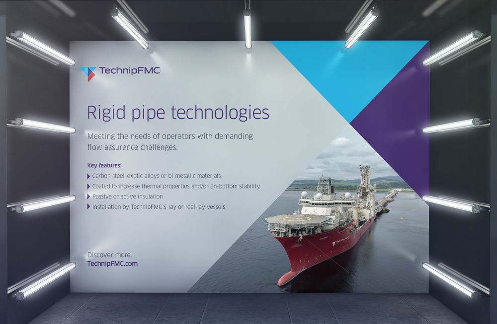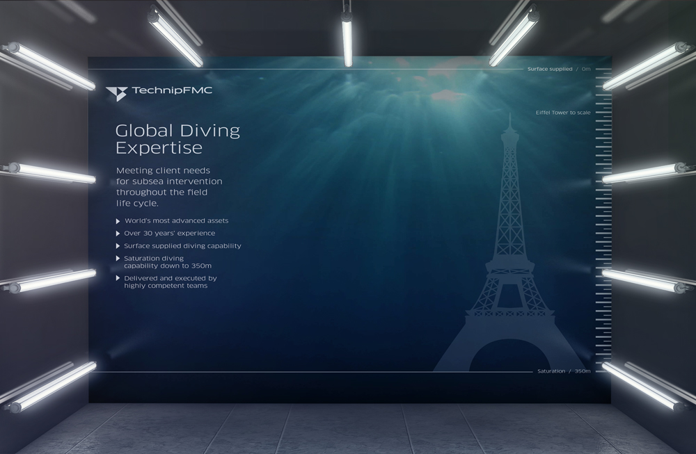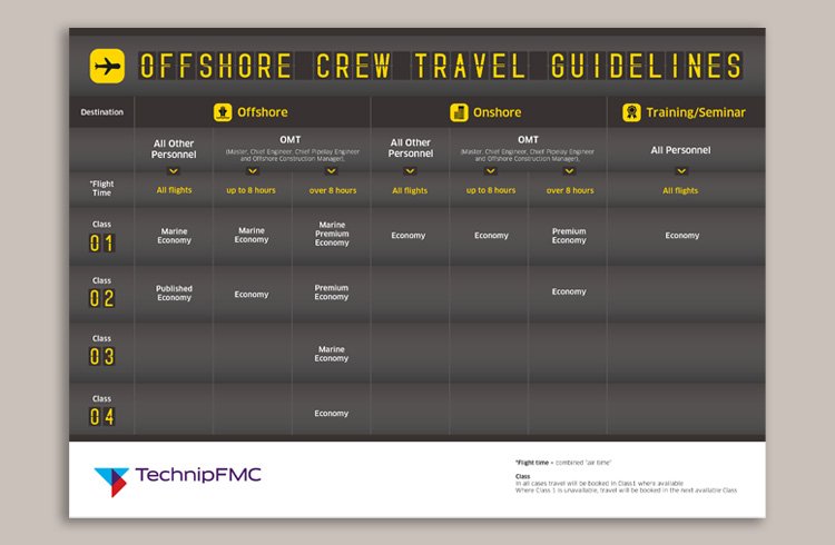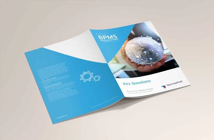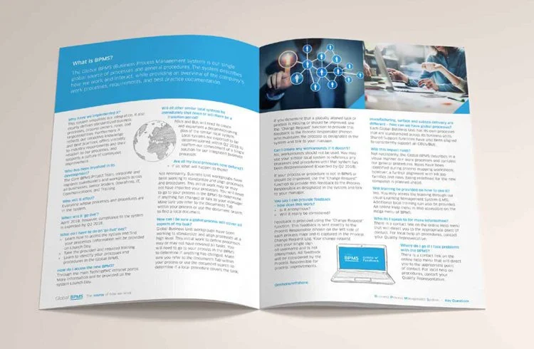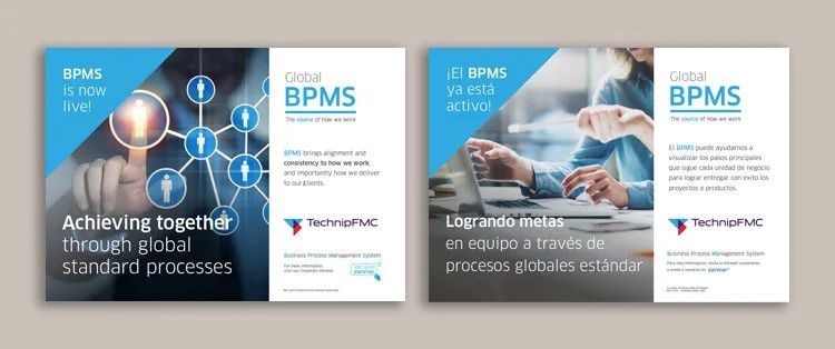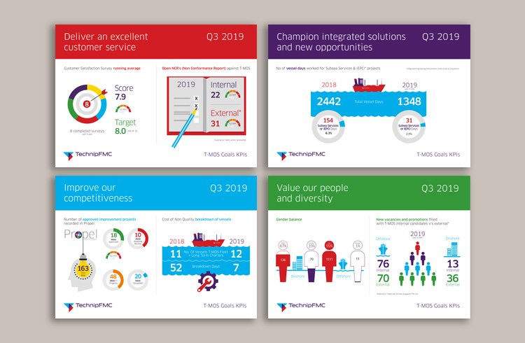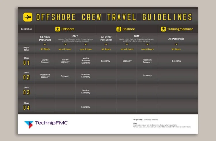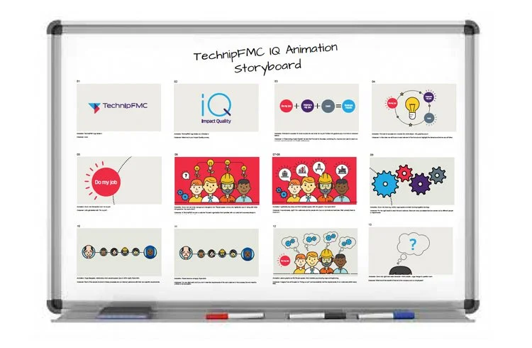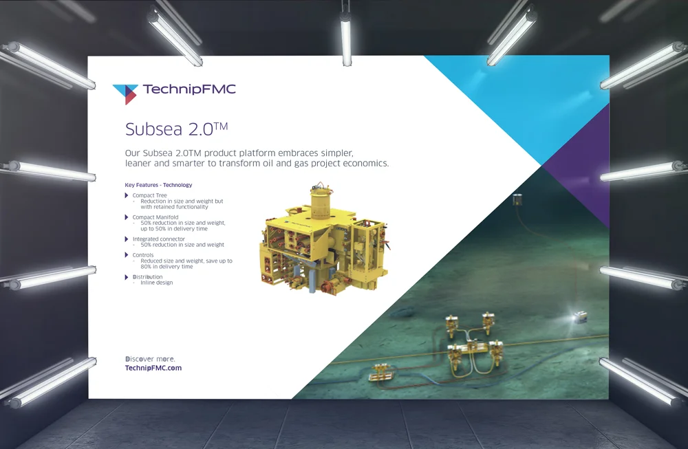
A long-standing relationship of over a decade led TechnipFMC to entrust me with creating design and marketing materials for communications teams across the UK, Paris, and Houston. I maintained strict brand consistency throughout, delivering assets for internal campaigns that communicated complex information clearly and engagingly. Outputs included brochures, posters, exhibition displays, infographics, PowerPoint presentations, and user guide animations.
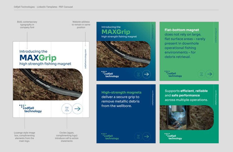
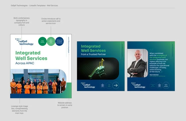
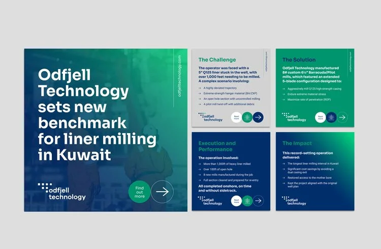
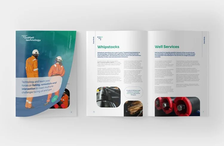
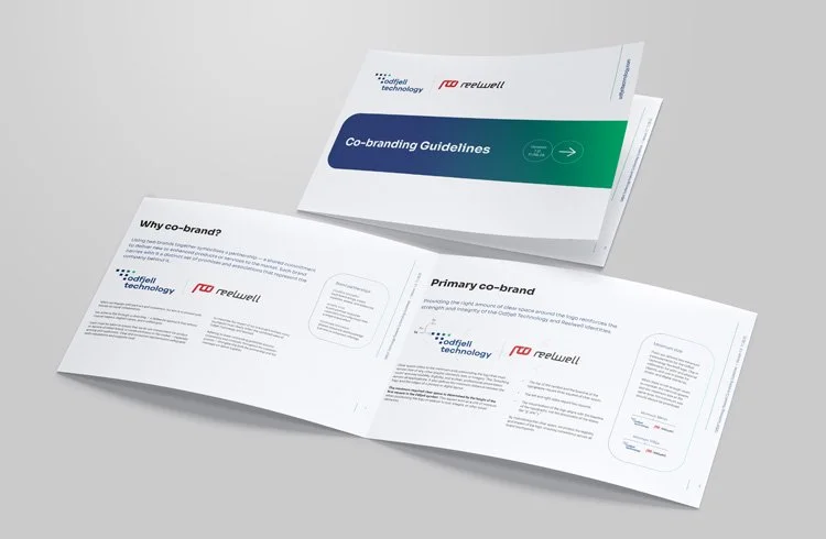
Odfjell Technology sought to refresh their existing social media templates to better align with their evolving brand identity. I designed a cohesive suite of LinkedIn-ready templates that enhanced visual consistency and engagement. This work naturally extended into the development of supplementary brand guidelines for co-partnerships, with a primary focus on ensuring consistency and continuity across all brand touchpoints.
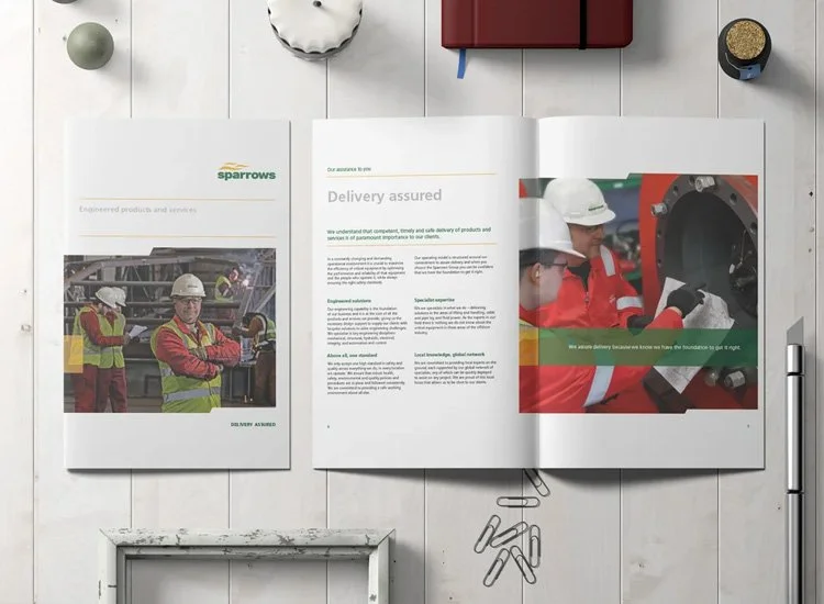
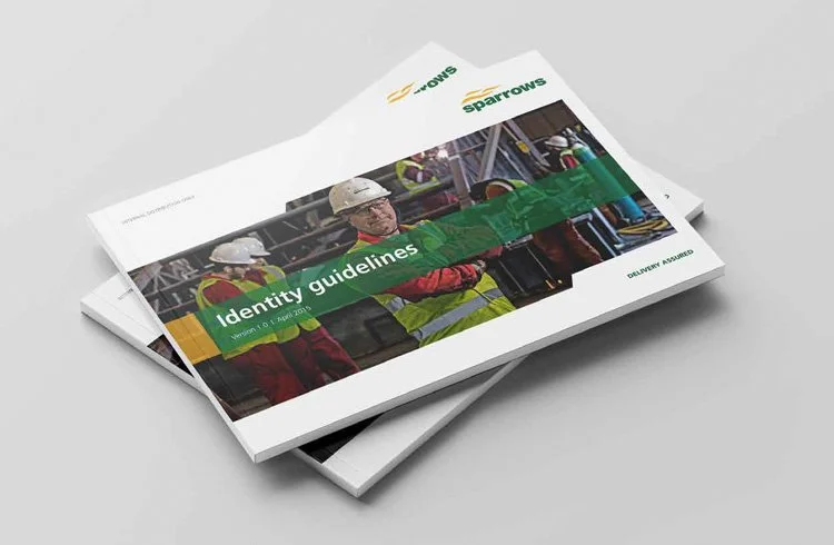
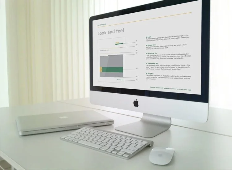
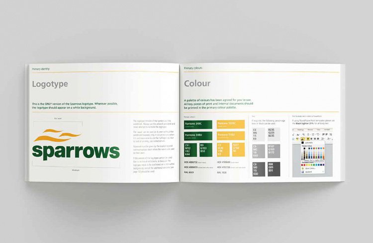
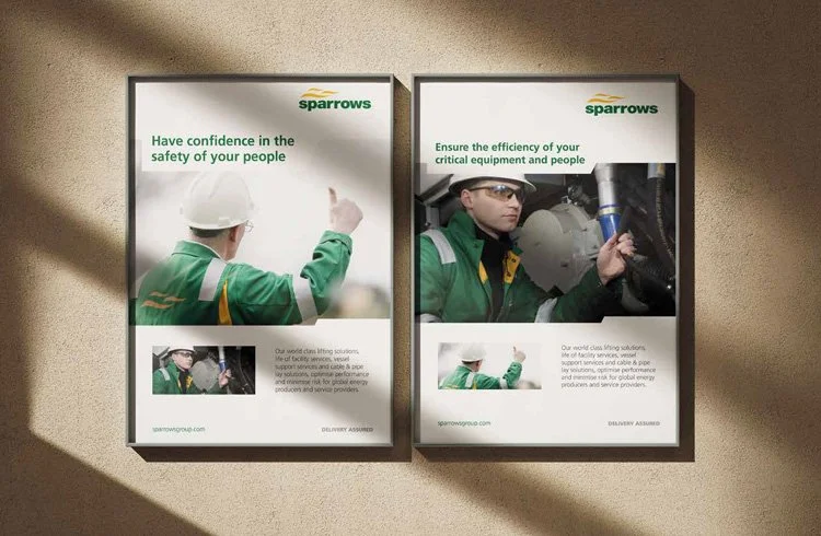
Sparrows were looking for design guidance to help refresh their existing marketing material. Working alongside their marketing department and inhouse design team, I created a suite of template files and a set of brand guidelines demonstrating the updated style and how it should be adhered too. The revamped marketing material was successful and gave Sparrows professional continuity throughout the group.
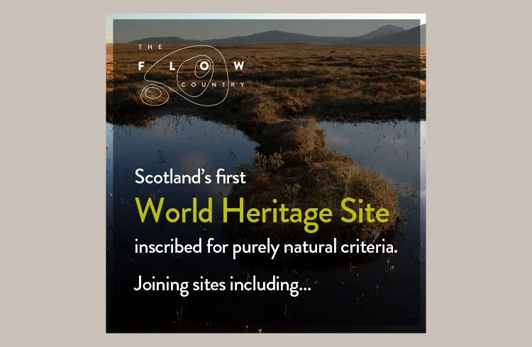
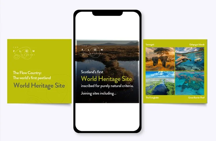
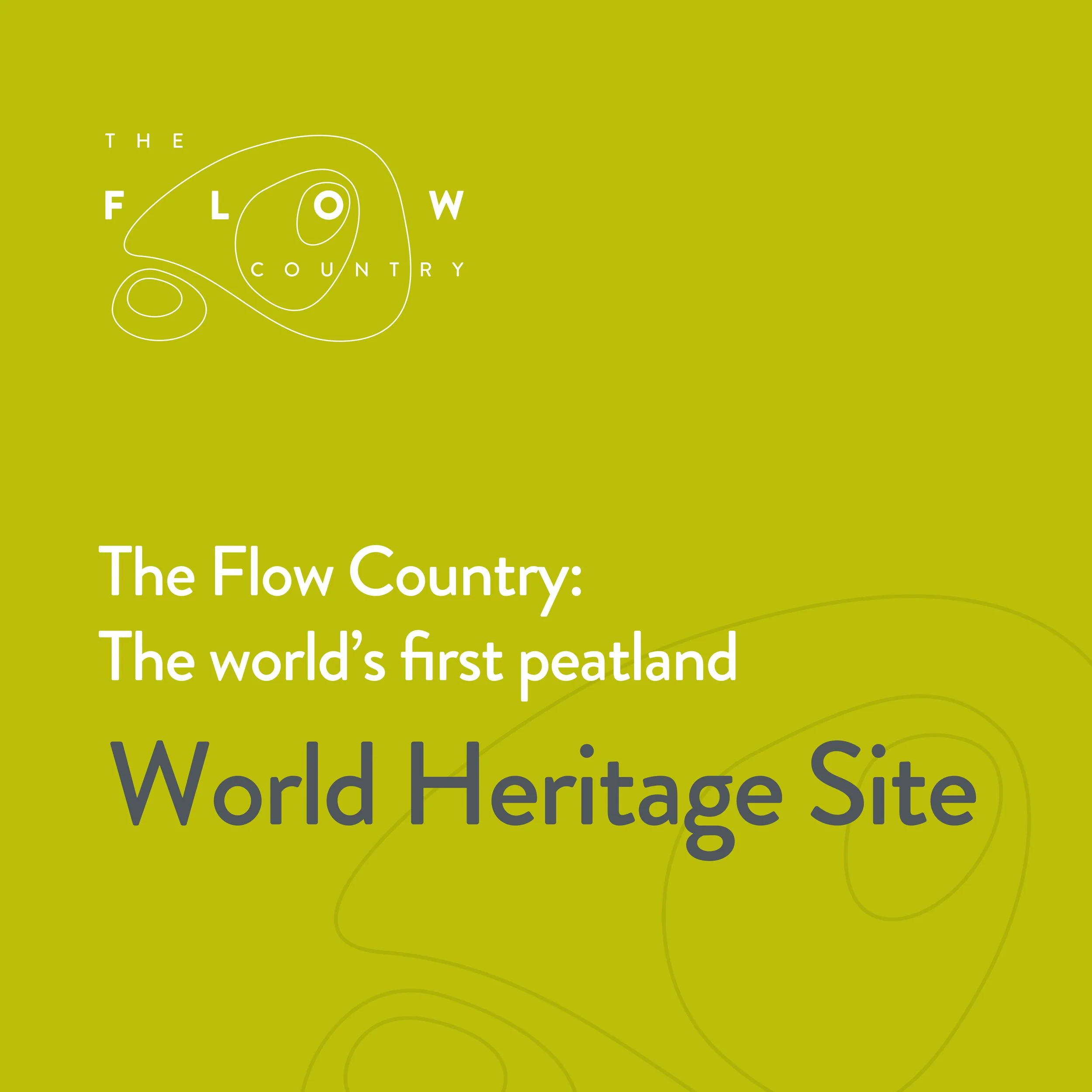
Exciting times at The Flow Country Partnership. After years of tireless work, this charity finally achieved the first Scottish UNESCO World Heritage Site status for its site in Caithness. Officially, the world’s first peatland World Heritage Site. It joins the Serengeti, the Galapagos Islands, the Great Barrier Reef, and the Everglades as natural areas gaining World Heritage site status for their incredible ecosystems
A place of global significance in the fight against climate change, the status unlocks opportunities for the north of Scotland including green jobs.
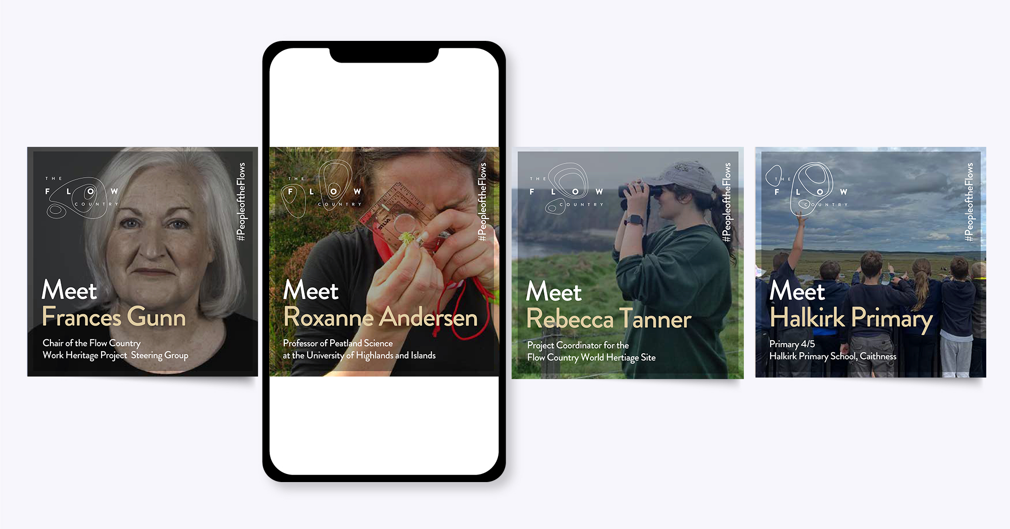
To announce this phenomenal news, I was asked to produce an engaging new style for their social media graphics whilst ensuring brand guidelines were adhered to.
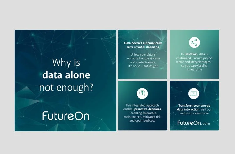
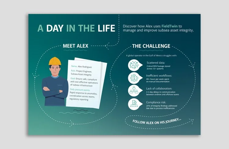
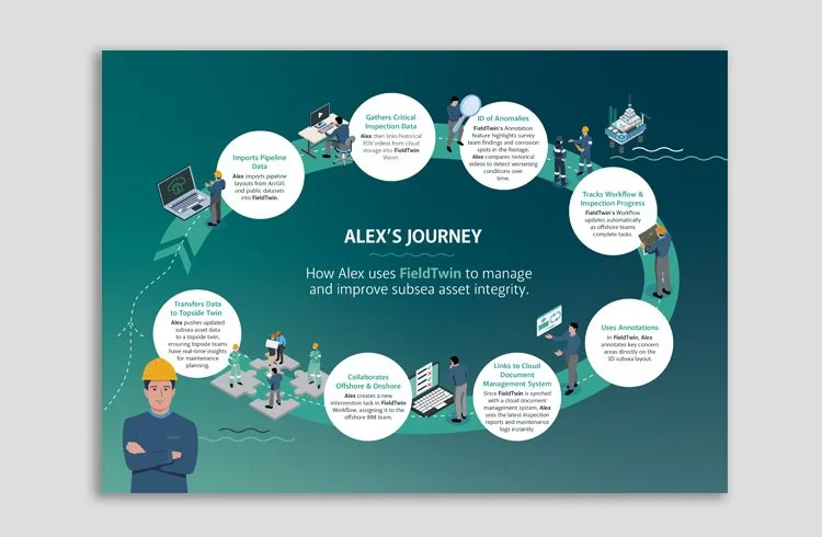
FutureOn helps the world’s largest energy companies visualise, design and collaborate on their critical infrastructure projects, from offshore fields to wind farms, all in one unified platform.
My role was to visually communicate this complexity—developing a suite of social media and explanatory graphics that made the technology accessible, engaging, and easy to grasp.
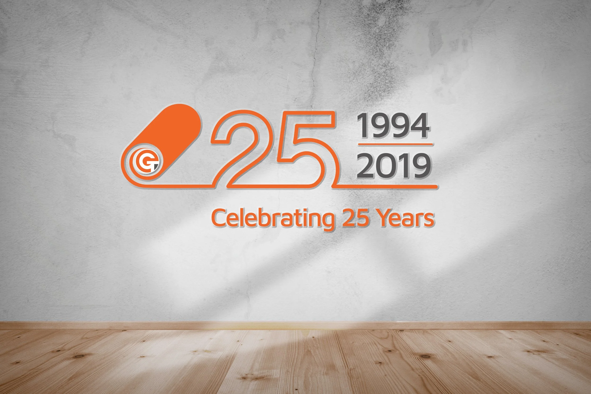
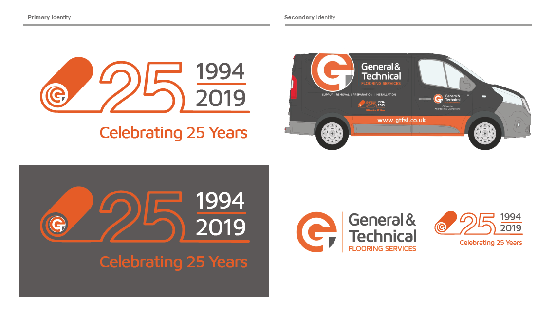
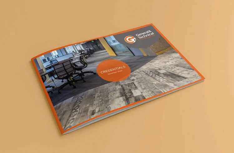
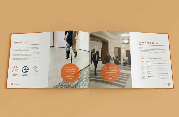
General & Technical, a Scotland-based commercial flooring company, sought to celebrate their 25th anniversary in style. To complement the existing brand, a supplementary anniversary logo was developed, incorporating a rolled carpet icon while retaining the company’s established colours and typography.
The identity was applied consistently throughout the year-long celebrations, featuring across vehicle livery, digital platforms, and social media.
In addition, a company brochure and a suite of templates for advertising and social media were created, all aligned with the existing G&T corporate style to ensure brand consistency across every touchpoint.
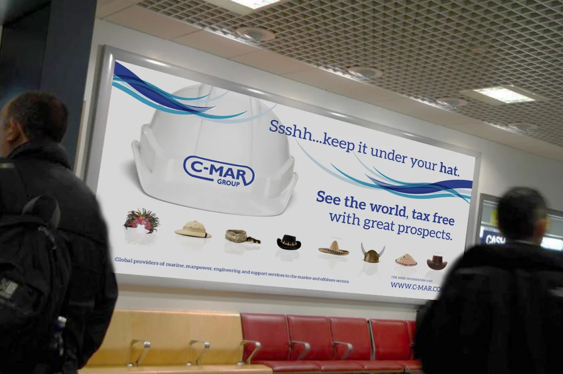
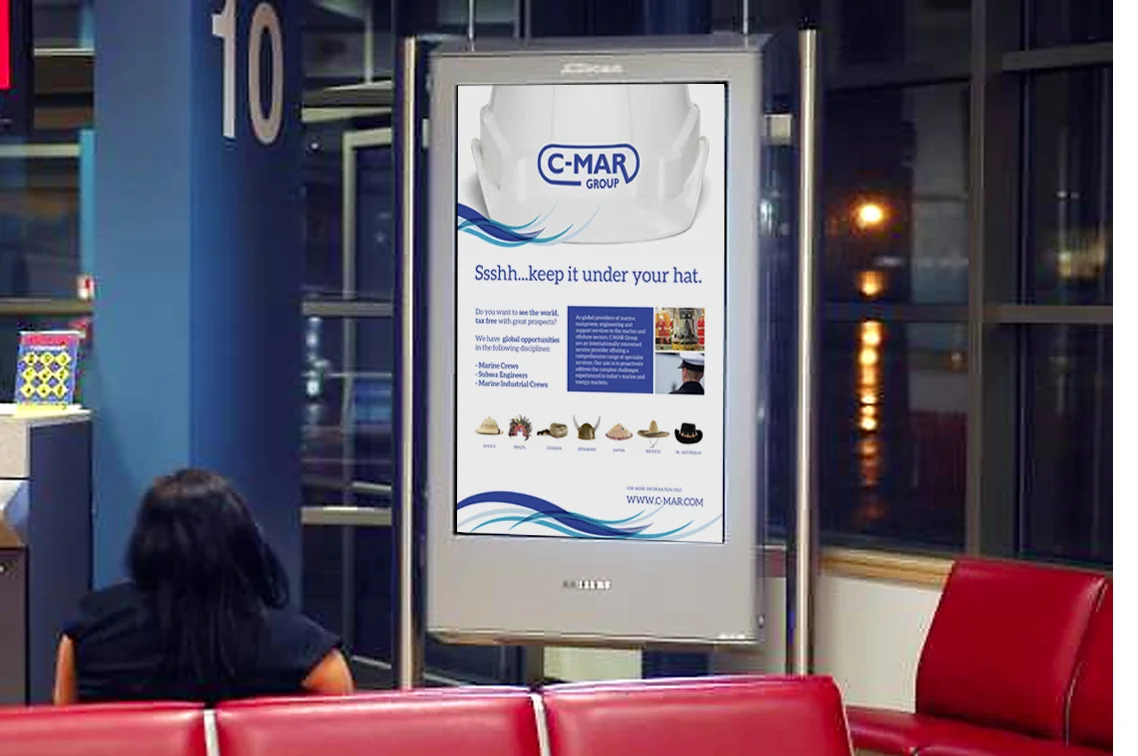
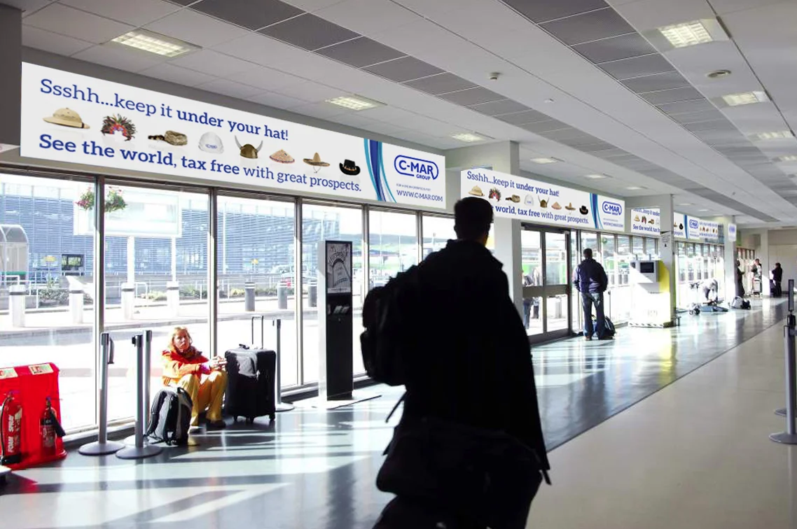
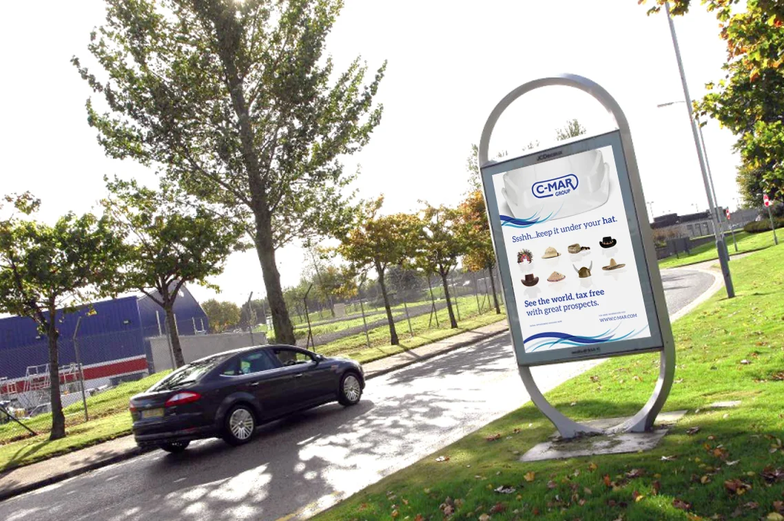
To position C-MAR Group as a gateway to global offshore careers, we developed a bold visual campaign centered around culturally iconic hats. Each execution symbolised a different region, highlighting the diversity and lifestyle benefits of expatriate work. Targeting industry professionals through high-impact placements at Aberdeen Airport, the campaign connected with a mobile workforce at key decision moments, reinforcing C-MAR’s international reach and appeal.
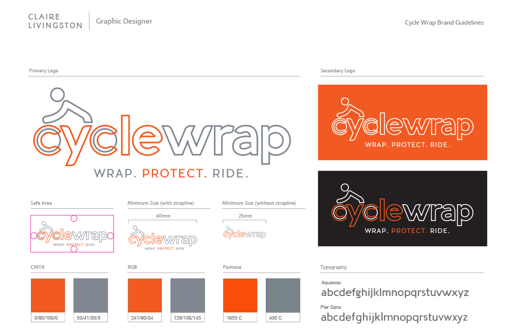
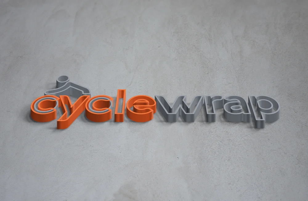
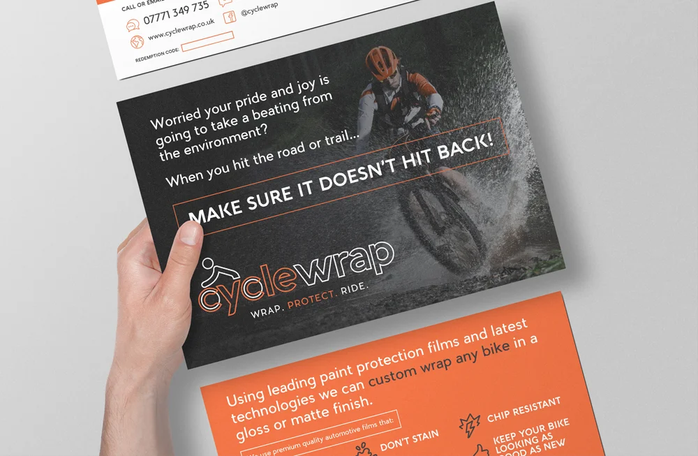
I was asked to produce an identity for a unique venture. After spending £2,000+ on a bike, you want to protect it. Right? That’s where Cyclewrap come in. They wrap your bike in protective film so you can disappear into the mountains without worrying about a chip or bump.
The identity had to be trendy, slick and fit in alongside other big mountain biking brands. It also had to be adaptable, to mould as the company grew. They are now diversifying into racing bikes and producing their own brand of wax and polishing cloths.
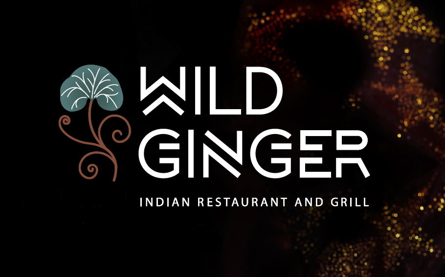
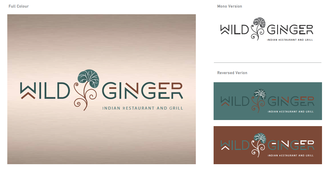
Wild Ginger, an upmarket Indian restaurant, set out to establish a distinctive identity in an increasingly crowded marketplace. At the heart of the brand is a refined logo that combines contemporary typography with a stylised ginger foliage leaf, subtly referencing its culinary roots while maintaining a modern aesthetic.
For the owners, image was paramount. Their vision extended beyond food, aiming to craft a memorable and immersive dining experience. This commitment to branding is evident throughout the interior, where design elements consistently reflect the restaurant’s theme and personality.
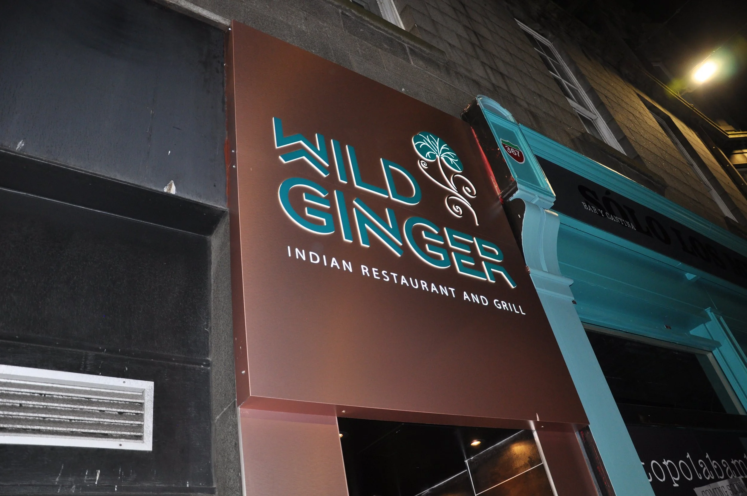
The illuminated signage plays a crucial role in bringing the brand to life on a busy high street, capturing attention and reinforcing Wild Ginger’s sophisticated presence.
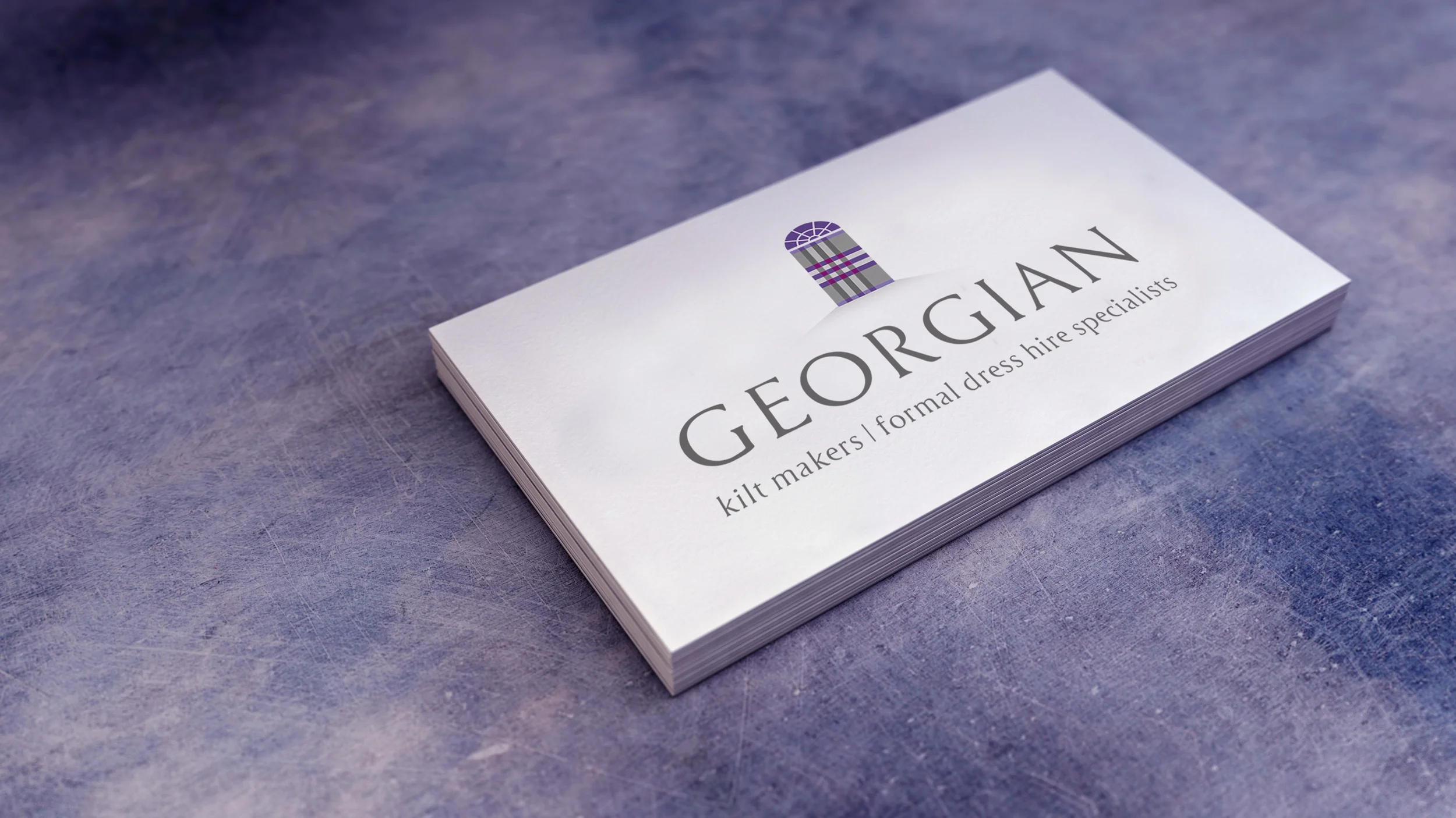
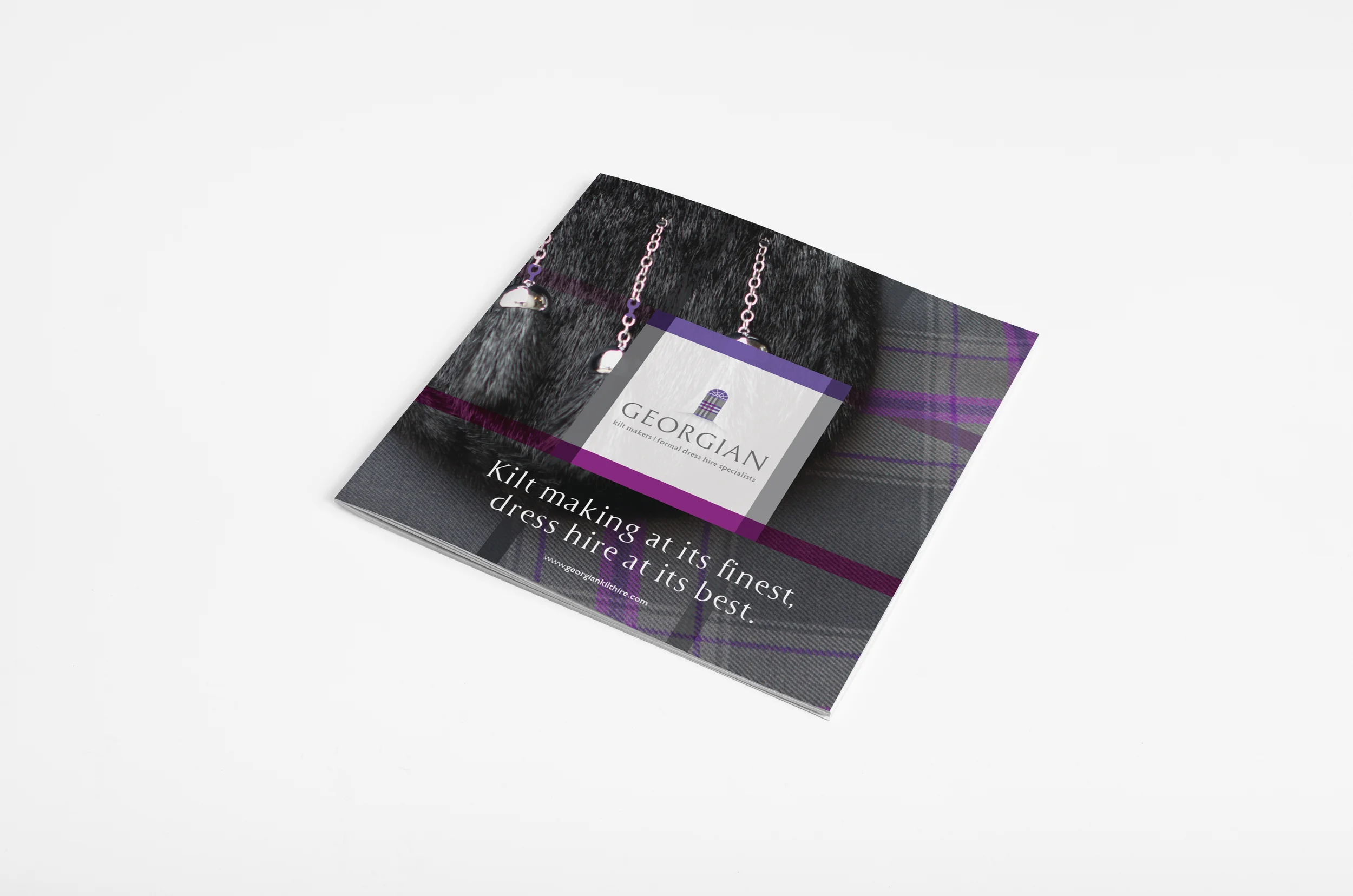
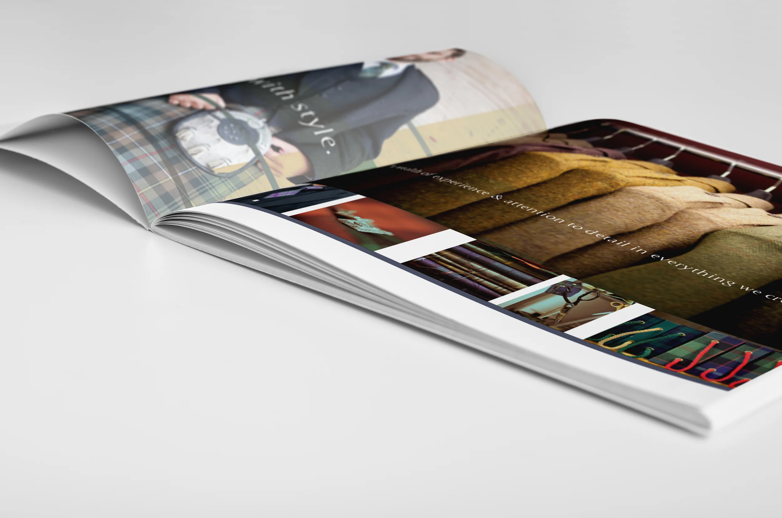
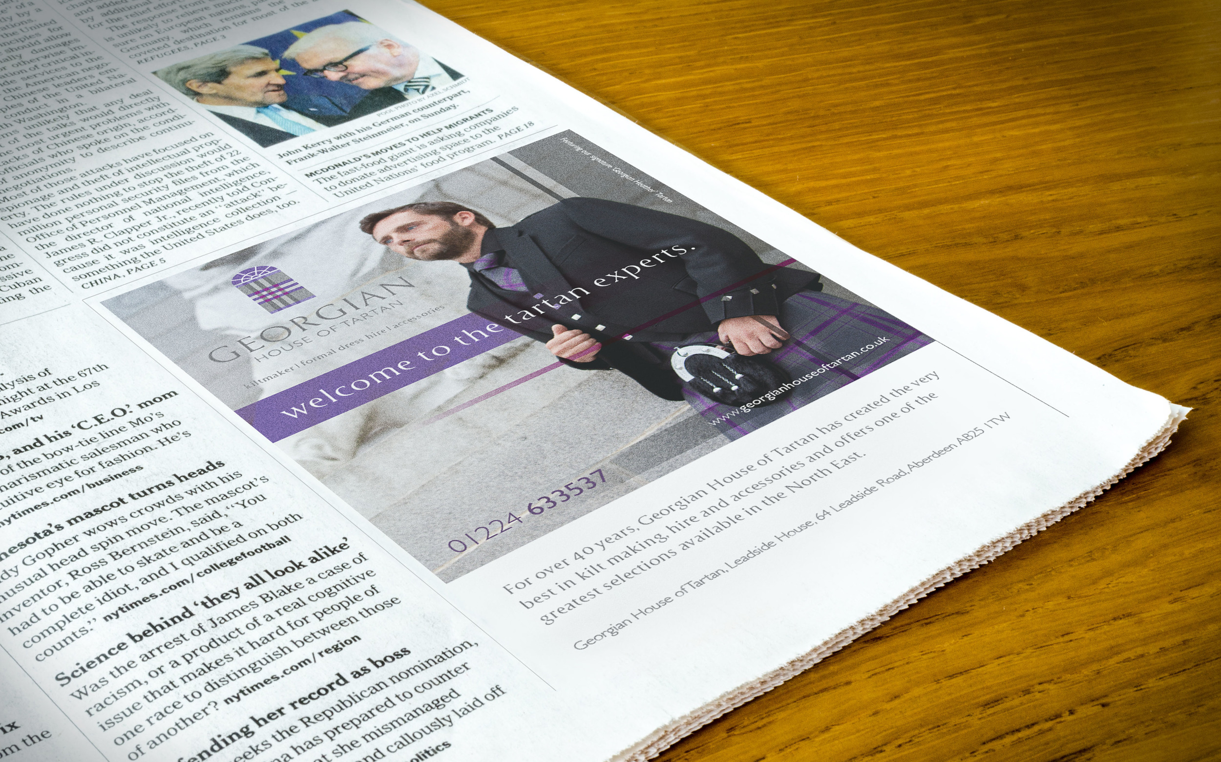
Georgian Kiltmakers in Aberdeen sought to rebrand in order to distinguish themselves within a highly competitive market. Preserving the company’s core values and long-standing traditions was central to the design process. The new identity and supporting materials needed to reflect the heritage and craftsmanship inherent in kilt making, as well as the team’s depth of experience and expertise, while presenting a refined and contemporary visual style.